Each year, color giant Pantone announces a color of the year that influences design directions. While neutral shades will always be a popular choice for kitchens, bold colors also have their place: as cabinetry or countertops, or as small accents in hardware or appliances. Here are color directions worth considering for a kitchen remodel.
Orange
Orange palettes have been gaining ground. Terracotta, copper, gold, ginger, brass, henna, and clay paired with greens or blues give an exotic wilderness feel. Petrol-green and charcoal stay in vogue, especially as they make warm coral shades pop. Vibrant citrus like lemon and lime work as accent colors, as do muted pinks and peachy neutrals for a more classic feel.
Industrial
The industrial direction continues, with concrete surfaces and factory-look hardware. Brushed brass fits well with orange-themed palettes and gives a luxurious finish to small appliances, handles, sockets, and faucets. Shiny copper for sinks, faucets, and accents brings warmth to industrial kitchens or any style.
Blues and Greens
Calming, misty blues promote serenity, along with grays and the purple tones that have stayed popular. Aqua blue can be toned down with muted surroundings or used as a bold statement on walls or furniture. Blues and greens bring nature into the kitchen, with deep greens reminiscent of a forest.
Mindfulness
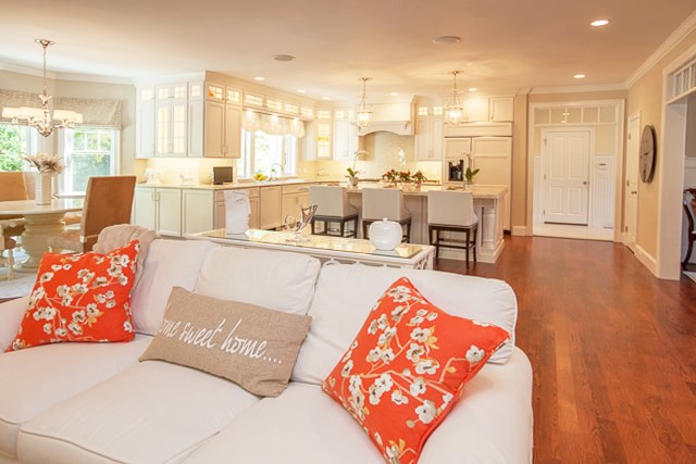
The mindfulness movement has influenced simple, clutter-free living, and with it has come light and clean colors. Subtle creams and off-whites are perfect for a minimalist space and can be enhanced by a clever lighting plan. Grays with differing undertones look smart yet calming, as do navy and brown shades for a Zen-style kitchen.
Jewel Tones
Jewel tones (deep purple, emerald, sapphire) enliven neutral palettes as accent colors. Deep berry red is a rich shade that brings coziness to a kitchen.
Raw Wood
Light-colored wood is a fresh take on heavy browns, beiges, or tans. It blends right into a minimalist palette or balances strong colors. Modern kitchens are always enhanced by pairing heavy, dark materials with raw or light-finished wood.
Color Pairings
If you're ready to break away from a purely neutral scheme, try a bold combination. Embrace the two-tone kitchen cabinet look and offset it with contrasting walls. Blue and raw wood cabinets against an orange feature wall or backsplash. Dark green and taupe cabinets with berry red. Yellow and charcoal cabinets against light blue walls. If you love the idea of a bold color but aren't ready to commit, try a backsplash tile feature, light fixtures, barstools, or small appliances in the bold color. These items can be easily added and swapped if tastes change.
Talk through color with a designer
If you're planning a kitchen and want to talk through color direction, we'd love to talk.
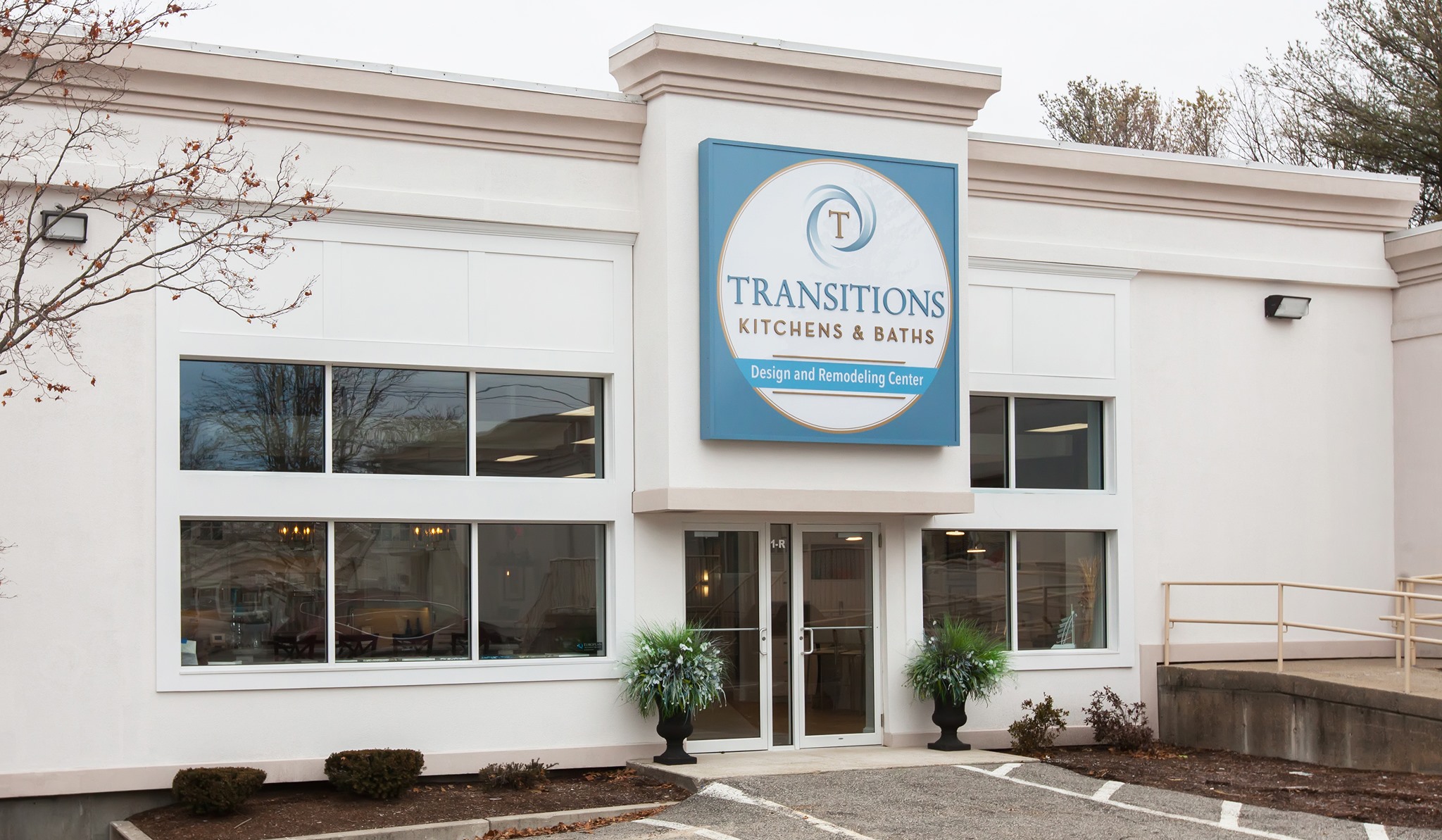
Schedule a showroom visit at our 5,000 square foot showroom in Norwell. No pressure, just a real conversation about your home.
Transitions Kitchens, Baths & Remodeling
433 Washington St, Norwell, MA
(781) 871-0881