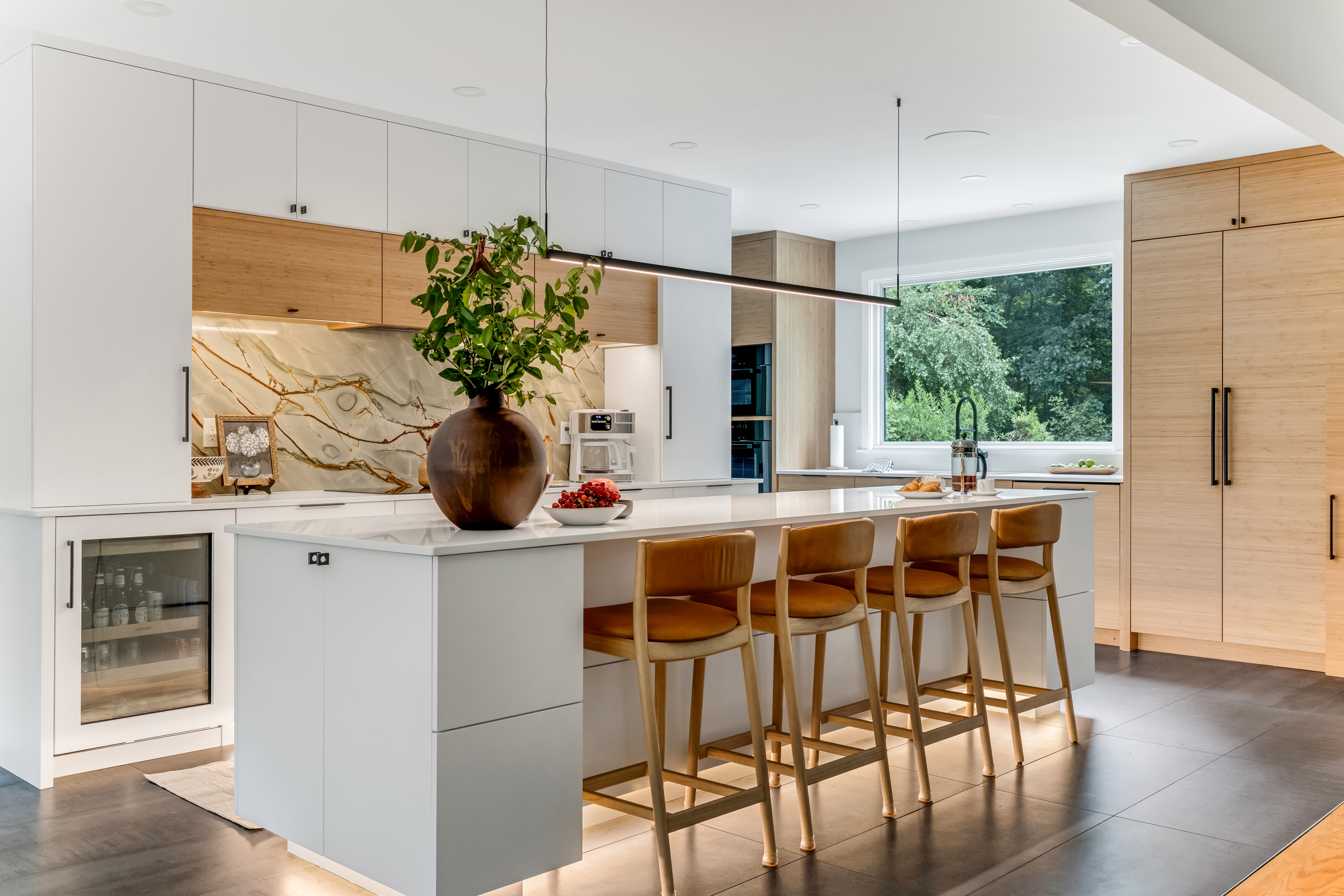

A two-tone kitchen uses two cabinet colors in one room. Most often that means an island in one color and the perimeter in another, but it can also mean darker lowers with lighter uppers, or a hutch, bar, or hood finished in a second color. Done well, it gives the room a focal point without adding a single square foot.
We have designed and built a lot of two-tone kitchens across the South Shore. Here is what we have learned about making two colors look like one plan instead of two ideas.
Three ways to split the colors
Island and perimeter. The most common version. The perimeter stays light to keep the room bright, and the island carries the color. Because the island sits in the middle of the room, it is where the eye lands first.
Uppers and lowers. A darker or warmer finish on the base cabinets with lighter uppers above. The wall stays open and airy, and the color sits low where it grounds the room.
A feature piece. A hutch, a bar, a coffee station, or a range hood in a second color. This is the quietest way to do it, and it works well in kitchens where an island is not part of the layout.
Navy and white
Navy with white is a pairing we come back to again and again. Navy is dark enough to anchor a room but soft enough that it does not feel heavy.
In this two-tone Norwell kitchen, a large navy island carries a quartz prep counter on the cooking side and a wood-topped seating counter on the other. Brass wire mesh inserts on the island doors act as a design focal point and a vented spot for fresh produce. The navy does not stop at the island. A display hutch and a dedicated bar area pick up the same color, so the second tone reads as part of the house rather than a one-off.
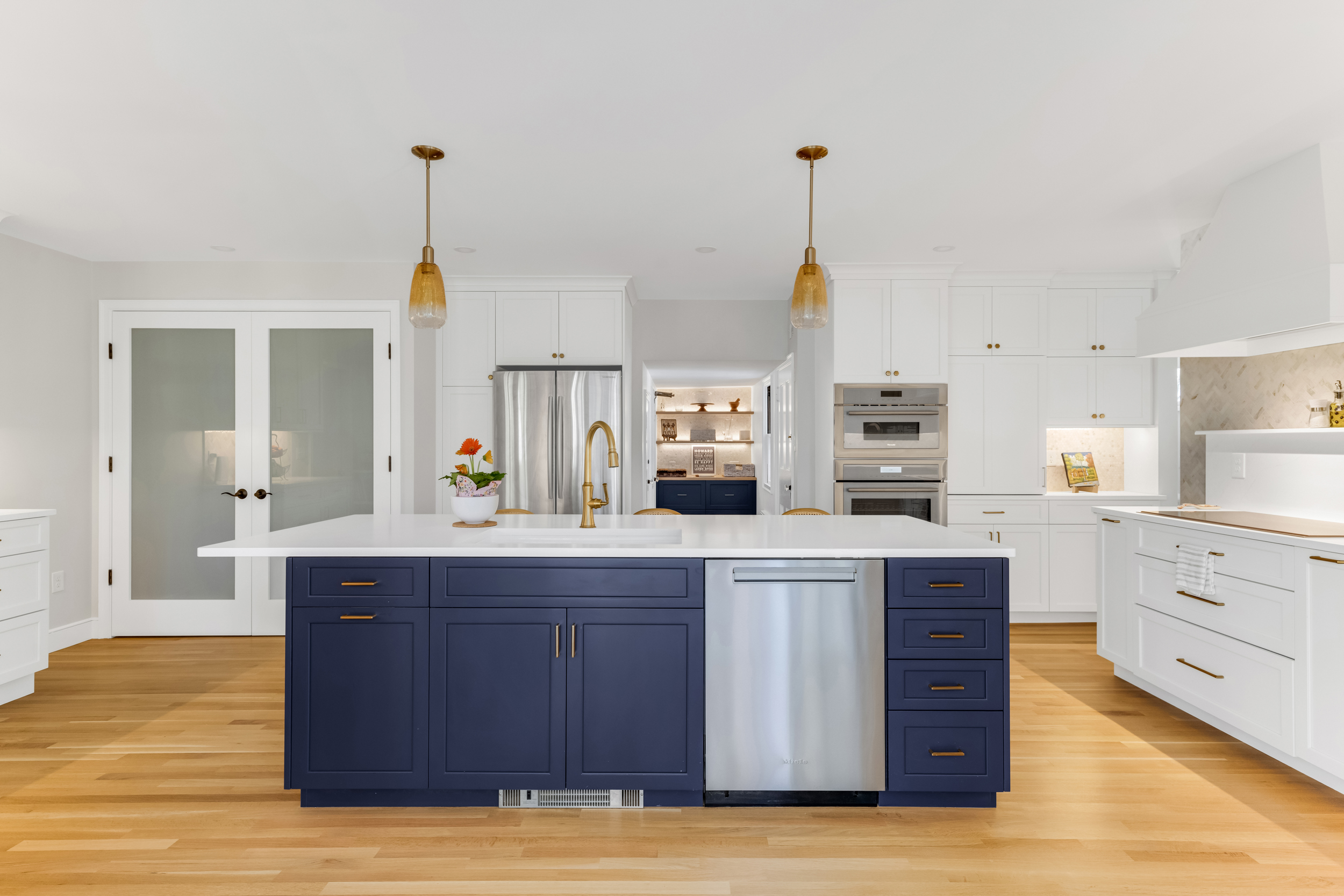
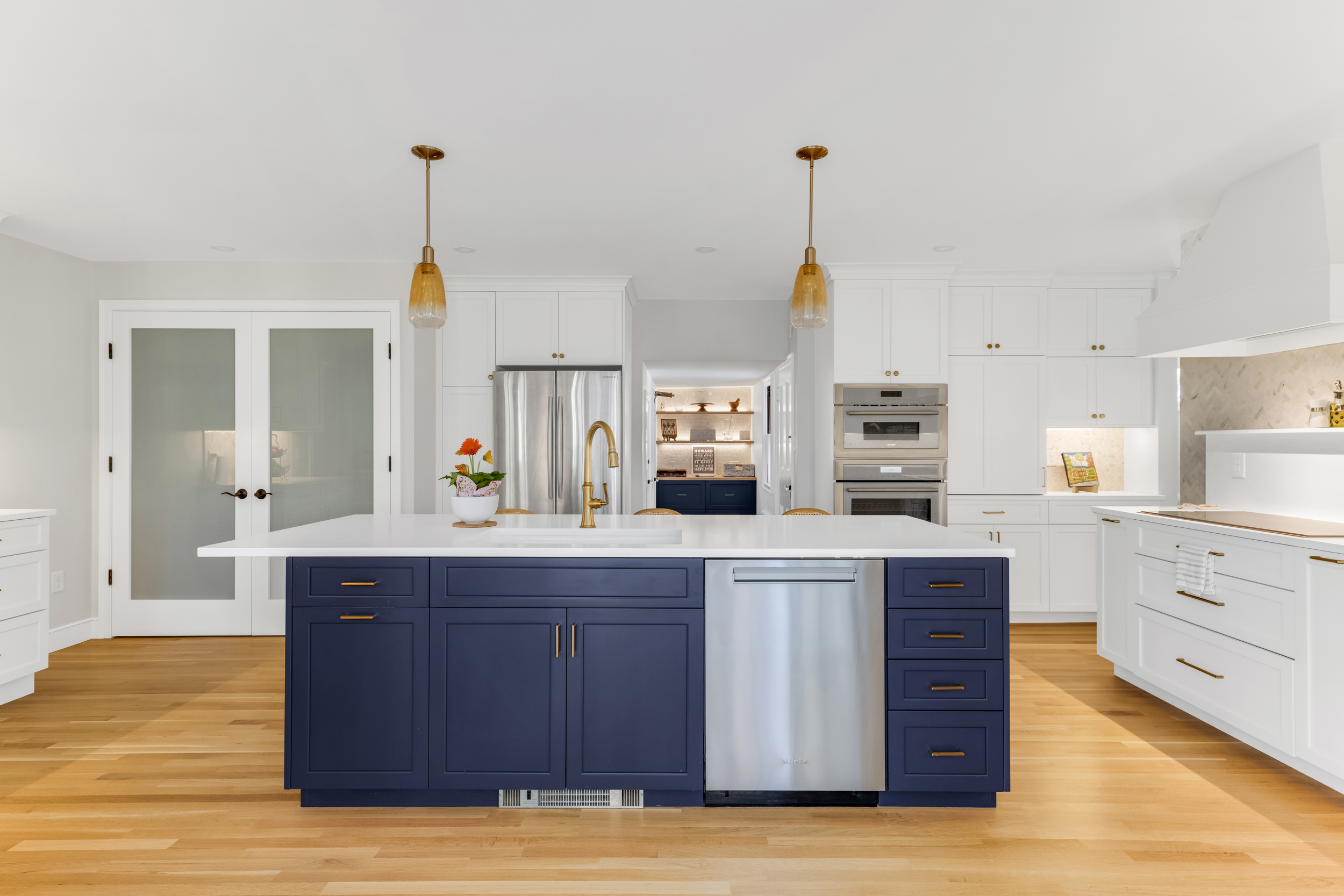
In a two-tone Milton kitchen, the island is Mouser's Nook door in Indigo Island and the perimeter is Mouser's Divinity door in Haven White. Same maker, same construction quality, two doors that read very differently next to each other. A single Calacatta Abrezza marble herringbone runs across every backsplash in the room, and that one decision is what keeps two colors and two door styles feeling calm.
Greens and soft blues
If navy feels too formal, a muted green or blue does the same job with a lighter touch.
This Hingham kitchen pairs white Mouser perimeter cabinetry in the Plaza Door style with a sage green island in the same line. Silestone Calacatta Gold counters run throughout, so the stone ties the two colors together, and brass pendants and sconces warm up the green.

In this Hanover kitchen, soft white Mouser perimeter cabinetry in a painted Radiance door sits around a Seaglass island and a matching Seaglass coffee station. Oak floating shelves add warmth against the white, and brass hardware and a trio of island pendants carry through the room.
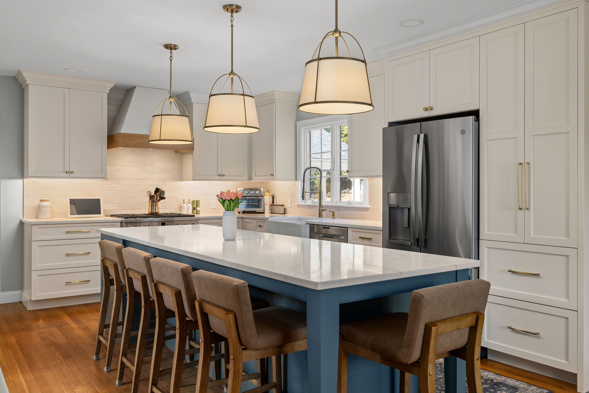
A deeper blue works too. In a Hingham first floor remodel, the perimeter is Mouser Centra in Ice white matte and the island is inkwell blue in the same Richmond door style, topped with Silestone Calacatta Gold in a soft suede finish.
Wood and white
Wood is the most forgiving second tone. It reads as warm rather than bold, and it pairs with almost any white.
The timeless Norwell kitchen we designed with Riverside Builders sets a wood island inside a perimeter of white Mouser inset maple. The island gives the room a natural focal point, and brass hardware and glass-front uppers keep the white from feeling plain.

In a Cohasset kitchen, the split runs the other direction. Light wood beaded inset Mouser cabinetry runs along the lower cabinets with white uppers above, which keeps the wall open while the wood warms the room at eye level and below.

How to make two colors look intentional
Keep the cabinetry in one family. The Hingham, Hanover, and Milton kitchens above all use one cabinet line for both colors. That keeps the construction, finish quality, and door reveals consistent, so the only thing that changes is the color. You can change door styles between the island and perimeter, as the Milton kitchen does, and still keep the maker the same.
Let one material run through the whole room. In Hingham it is the countertop. In Milton it is the backsplash. When one surface stays constant, the two cabinet colors read as a pair.
Pick one metal family. The Milton kitchen runs Top Knobs hardware in Honey Bronze on every cabinet, with a faucet in the same finish family and amber glass pendants over the island. Mixing a second color in the cabinetry is easier when the metals are not also competing.
Decide what the range hood belongs to. In Milton the custom hood is painted to match the perimeter, so the cooking wall reads as one clean composition. In Norwell the hood is wrapped in a natural wood accent that echoes the wood top on the island. Either works, as long as it is a choice.
Put the bold color where you want people to look. Usually that is the island. If the island is small or there is no island, a hutch, bar, or coffee station is a better place for it than a long wall of base cabinets.
Carry the second color past the kitchen
The two-tone kitchens that feel most finished let the second color show up somewhere else. In Norwell, the navy continues into a display hutch and a bar with wine storage. In Milton, a built-in navy console with floating white oak shelves gives the hallway its own moment, and the laundry room picks up the same vocabulary in Mouser Divinity cabinetry finished in Ash Gray. Built-ins, mudrooms, and laundry rooms are all part of the specialty spaces we design and install.
When all white is the better call
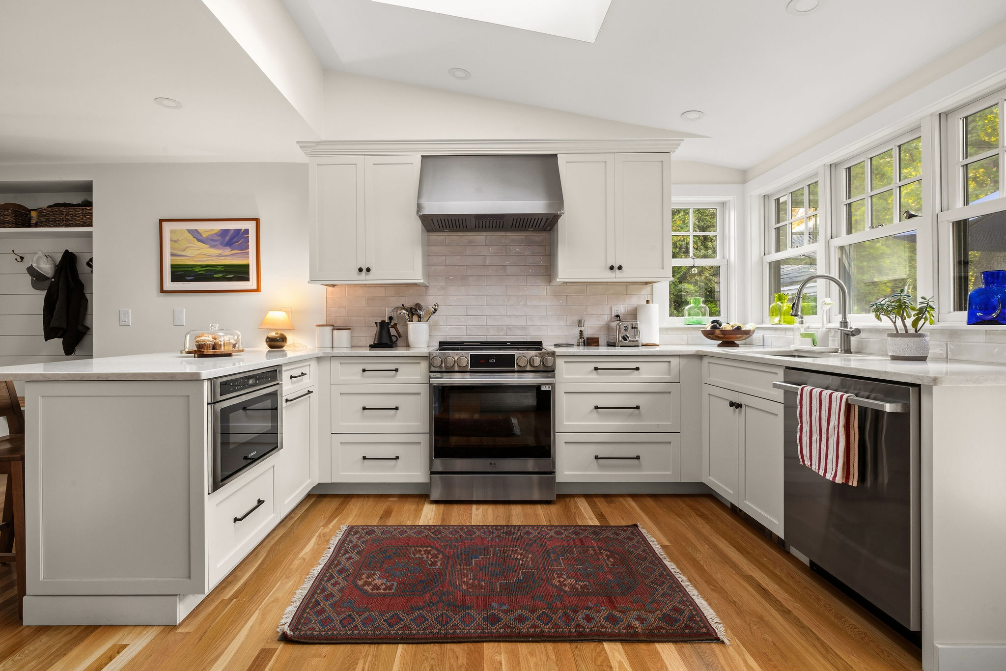
Two-tone is not right for every kitchen. When the room already has architecture of its own, white can be the stronger choice. In this Hingham kitchen, a vaulted ceiling and a new skylight do the work a colored island would do elsewhere, so the cabinetry stays a clean white. Navy still shows up, on a Mouser vanity in the powder room just off the kitchen.
Common questions
Should the island be the darker color? Usually, yes. A darker island grounds the middle of the room while a lighter perimeter keeps the walls bright. A light island against darker perimeter cabinets can work in a large, very bright room, but it is the exception.
Do both colors have to come from the same cabinet line? It is the safest way to do it. Two lines can have different construction, door reveals, and paint finishes, and those differences show when the cabinets sit side by side. Our cabinet line comparison covers what each of our lines offers.
How do I choose the two colors? Look at real doors in real light. Paint chips and screens will not tell you how a navy reads next to a white once both are on full-size cabinet doors under your kitchen lighting.
See the colors side by side
Our showroom on Route 53 in Norwell has real cabinet, countertop, and fixture displays, so you can see an island color next to a perimeter color in person before you commit. Schedule a showroom visit and one of our designers will walk you through it.
Transitions Kitchens, Baths and Remodeling designs and builds kitchens, bathrooms, and first floor remodels across the South Shore and Greater Boston. One team, responsible for every detail.